
How Color Psychology Transforms Interior spaces?
When it comes to designing a space, color plays a significant role in setting the mood, creating ambiance, and evoking emotions. Color psychology, the study of how colors affect human behavior and emotions, is a powerful tool in interior design. In this blog post, we will delve into the fascinating world of color psychology and discover how you can use it to create harmonious and impactful interiors.
Understanding Color Associations
Creating a Sense of Tranquility with Blues and Greens

Energizing Spaces with Vibrant Reds and Oranges
Reds and oranges are known for their energizing and stimulating effects. These warm colors can evoke feelings of excitement, passion, and warmth. Vibrant reds can be used as accent colors in areas where you want to create a focal point or add a touch of drama, such as an accent wall or furniture pieces. Oranges, with their invigorating and sociable nature, are great for spaces where social interaction is encouraged, like kitchens or dining areas.

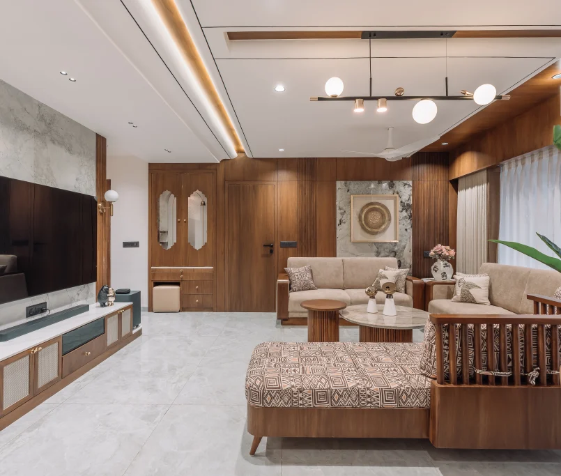
Promoting Harmony and Balance with Neutrals
Neutral colors such as white, gray, and beige provide a timeless and versatile backdrop for any interior design scheme. They create a sense of calm, balance, and sophistication. White, often associated with purity and cleanliness, can make small spaces appear larger and brighter. Gray, with its wide range of shades, offers a neutral base that pairs well with other colors, allowing you to create a variety of atmospheres. Beige, a warm and comforting neutral, adds a touch of warmth and coziness to a space.

Using Accent Colors to Make a Statement
Accent colors add personality and visual interest to a room. They are often bold and vibrant hues used sparingly to create focal points or highlight specific architectural features. Accents can be achieved through colorful furniture, artwork, accessories, or even a single painted wall. For example, a pop of yellow in a predominantly neutral room can inject energy and optimism, while a splash of deep purple can add a sense of luxury and elegance.
The Importance of Balance and Contrast
Conclusion
Color is a powerful tool in interior design, capable of influencing our emotions, moods, and overall well-being. By understanding color psychology and incorporating it into your design process, you can transform any space into a harmonious and inviting environment. For the best results, consider consulting with a professional interior designer for home to help you navigate the intricacies of color selection and application.