
Office Interior Design Ideas: A Practical Guide for Business Owners in Ahmedabad
You have signed the lease. The floor plan is in hand. Now comes the question most business owners underestimate: how do you turn an empty commercial space into an office that works well, looks impressive, and actually reflects what your business stands for?
Office interior design ideas are everywhere. Pinterest boards, Instagram feeds, competitor offices you have walked into and quietly admired. The hard part is not finding inspiration — it is knowing which ideas are worth pursuing for your specific space, your team size, and your way of working.
This guide breaks that down practically. No vague advice about “creating a positive atmosphere.” Just the decisions that matter, in the order you should be making them.
Before You Look at a Single Design Idea, Answer These Questions
The most expensive office design mistakes happen before a designer is even hired. A business owner sees a beautiful open-plan workspace on Instagram, decides that is what they want, and ends up with a floor full of people on phone calls with nowhere to go.
Good office interior design starts with how your business actually functions — not how it looks in someone else’s space.
Ask yourself:
How does your team spend most of its time? Focused individual work, collaborative discussion, client-facing meetings, or a mix? The answer changes the entire layout approach.
How often do clients visit? A consulting firm where clients walk in every day needs a very different reception experience than a back-office operation where clients visit once a quarter.
How much of your current space genuinely works? If you are renovating an existing office, be honest about what is actually broken — not just what looks dated.
How will the team grow over the next three years? An office designed for 15 people that can only stretch to 18 becomes a problem faster than most owners expect.
Answering these questions first means every design idea you consider gets filtered through what your business actually needs — not just what looks good.
Space Planning — The Decision That Shapes Everything Else
Zone the Floor Before You Furnish It
The single most impactful office interior design idea is also the least glamorous: divide your space into functional zones before touching furniture, colours, or finishes.
A well-planned office has five clear zones:
Reception and entry — The first 20 seconds of a client’s visit happen here. It needs to be uncluttered, well-proportioned, and carry your brand’s character immediately. A cramped or generic reception area erodes confidence before a meeting even begins.
Primary work zone — Where your team spends most of the day. Layout here depends on your work culture. Rows of individual workstations for focused work. Open clusters for teams that collaborate constantly. A hybrid of both for offices where both types of work coexist.
Meeting and conference zone — Physically separated from the work floor so a meeting does not disrupt the people who are not in it. Consider both a formal conference room for larger discussions and a smaller two-to-four person huddle room for quick calls and project reviews.
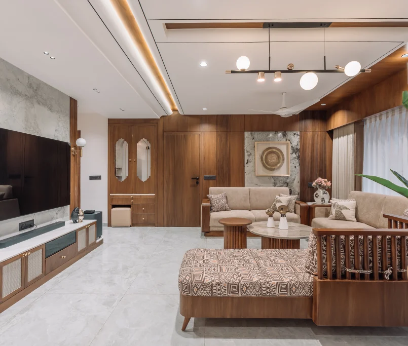
Private cabin zone — For leadership, HR, or any role where confidentiality matters. Glass-fronted cabins are now the preferred approach — they maintain privacy without cutting off natural light or making senior staff feel disconnected from the team.
Breakout and informal zone — This does not need to be large. A well-designed corner with comfortable seating, good lighting, and a pantry nearby gives people a real mental break — which means they return to their desks sharper. Offices that skip this zone often see productivity drop after lunch.
Skipping the zoning stage and going straight to furniture selection is the most common reason office renovations feel “off” even when the individual pieces look fine. Without zones, spaces compete with each other instead of supporting each other.
Lighting — The Element That Changes Everything and Gets the Least Attention
Walk into a poorly lit office and you feel it immediately — a low-grade fatigue that sets in within an hour. Walk into a well-lit one and you rarely notice the lighting at all. That invisibility is the goal.
Effective office lighting works across three levels:
Ambient lighting handles overall illumination. LED panels in the 3000K to 4000K colour temperature range reduce eye strain across long work days. Avoid cool white fluorescents — they are harsh and ageing. In Ahmedabad’s climate, where heavy curtains often block natural light to manage heat, good ambient lighting carries more responsibility than in cooler cities.
Task lighting addresses individual workstations. Desk lamps or under-shelf lighting help in areas where detail-oriented work happens — accounting, drafting, detailed documentation. Relying on ambient alone leaves people squinting at screens.
Accent lighting is where personality enters the plan. A backlit brand wall in the reception. Warm spotlights above a seating area. Indirect cove lighting in a boardroom. These are not expensive additions — but they shift a space from functional to impressive.
Natural light deserves its own consideration. Workstations positioned to receive indirect natural light — not direct afternoon sun — have a measurable effect on energy and mood. Where direct sunlight is unavoidable, frosted glass panels or quality solar shading manage glare while preserving daylight. Getting this right in Ahmedabad, where summers are intense, requires intentional planning rather than guesswork.
Office Colour Schemes — Choose With Intention, Not Instinct
Colour in a workspace is not decoration. It is environment. And the wrong environment costs you in ways that are hard to attribute but very real — low energy, poor focus, a space that feels misaligned with your brand.
A few principles that hold up in practice:
Blues and muted greens support concentration and calm. Well-suited to finance, legal, and any environment where detailed, careful work is the norm.
Warm neutrals — off-whites, warm greys, soft taupes — feel premium without the sterility of pure white. They work well as a base tone across the entire office, with other materials adding warmth and texture.
Brand colour as accent, not wallpaper. Your brand colour used on a reception feature wall, in dimensional signage, or in a single deliberate material choice ties the interior to your identity. Used everywhere, it overwhelms the space and looks like a showroom, not a workplace.
The three-tone rule: The most cohesive offices work within three tones — a dominant neutral, a secondary warm or cool tone, and one accent. More than that, and the space starts to fragment.
Whatever you choose, decide before procurement begins. Colour decisions made under time pressure — when the carpenter is waiting and the painter is next in line — are the ones that get regretted.

Cabin Design — Privacy Without Isolation
The era of the completely closed cabin is mostly behind us, and for good reason. Closed cabins cut off light, create a sense of hierarchy that many modern workplaces are moving away from, and make senior leadership inaccessible in ways that affect team culture.
But the opposite extreme — a fully open plan with no acoustic or visual separation — creates different problems. Phone calls, video meetings, and confidential conversations have nowhere to go.
Glass Partitions and Frameless
Panels
Glass-fronted cabins resolve this well. They create clear boundaries, preserve natural light flow across the floor, and allow senior staff to remain visually present in the office. Frosted or switchable smart glass adds privacy on demand without permanent walls.
For Ahmedabad offices where workstations are dense and the floor plan is compact, glass partitioning is one of the highest-return investments in the fit-out.
Acoustic Control — The Problem Most Offices Ignore Until It Is Too Late
Open-plan offices are productive for collaboration. They are terrible for focus work and phone calls. The solution is not to abandon open planning — it is to layer in acoustic control.
Simple interventions make a significant difference: fabric-covered wall panels in work zones, carpet tiles in meeting areas and cabins, acoustic ceiling baffles above dense workstation clusters. These do not require structural changes. They can be planned from the outset at modest cost — or retrofitted later at considerably more.
Reception Design — Where the Brief Meets the Brand
The reception area is the only part of your office that every visitor will see. It is worth more design investment than most fit-outs allocate to it.
Strong receptions share a few consistent qualities:
A reception desk that is proportioned correctly for the space — neither so large it dominates nor so small it disappears. Your company name or logo as a physical element — dimensional lettering, a backlit panel, or a material feature wall — rather than just a printed sign. Seating that signals the quality of your business: well-chosen, appropriately sized, not pulled from an office supplies catalogue. Lighting that is warmer and more considered than the work floor behind it, creating a transition from the public street to the private workspace.
The reception does not need to be large to leave an impression. Some of the most effective receptions we have worked on are under 200 square feet. Scale is not the deciding factor — proportion, material, and detail are.
Materials and Finishes — Choose for Ten Years, Not the Photograph
Offices take daily use from many people across many years. The finishes that photograph beautifully in week one need to still look right in year five.
Flooring: Vitrified tiles are practical, durable, and available in a wide range that can look genuinely premium. Engineered wood or wood-look LVT works well in cabin zones and meeting rooms. Carpet tiles in conference and breakout areas add warmth and absorb sound. Polished marble in high-traffic corridors looks impressive initially and shows every scuff within months.
Walls: Washable paint in work zones — this is not a luxury, it is maintenance-friendly sense. Textured panels, wood cladding, or stone veneer in reception and boardroom areas add the depth and richness that paint alone cannot deliver.
False ceiling: Grid ceilings remain the practical standard for large office floors — they allow access to electrical, HVAC, and data services without demolition. In reception, boardrooms, and cabins, a designed ceiling layer — gypsum coffers, wood slats, or layered profiles — lifts the finish of the space significantly without large structural cost.
Furniture: Invest in seating before anything else. Ergonomic chairs at workstations are not an indulgence — they are the single furnishing decision with the most direct impact on daily comfort and long-term wellbeing. Everything else follows.

Translating Your Brand Into the Space
The most forgettable offices are generic. They could belong to any company. The memorable ones feel specific — like they could only belong to this business.
Brand integration in office design is not about putting your logo on every wall. It is about making design decisions — in materials, spatial layout, lighting temperature, and finishing details — that reflect what your company actually values.
A firm that leads with precision and expertise communicates that through clean geometry, quality materials, and an absence of clutter. A business that values energy and collaboration communicates it through open layouts, warm tones, and spaces that invite people to linger and talk. These are design decisions, not decoration choices.
The clearest brief you can give a designer is not a mood board. It is a clear articulation of what your company stands for, how your team works, and what you want a client to feel the moment they walk in. Everything else follows from that.
Five Office Design Mistakes That Are Easy to Avoid
Choosing aesthetics before function. A beautifully styled office that lacks adequate storage, proper cable management, or enough meeting space creates daily friction for the people working in it. Function first, always.
Designing only for today’s headcount. Build in flexibility for at least 25 to 30 percent more people than you currently have. Modular workstation systems and non-structural partitions make this much easier to accommodate.
Underestimating acoustic needs. Particularly in open-plan offices. Acoustic discomfort — the inability to focus or have a private call — is the most common complaint in modern office fit-outs and the easiest to address at planning stage.
Rushing material selection. Finishes selected under deadline pressure are almost always regretted. Build sample review and vendor sourcing time into your project timeline before the contractor is on-site.
Giving the designer an incomplete brief. The quality of the outcome is directly proportional to the quality of the brief. The more clearly you communicate how your business works, who uses the space, and what your brand represents — the more precisely a designer can respond to it.
Frequently Asked Questions
Before you finalise the floor plan — ideally before you sign the lease. A designer involved early can assess ceiling heights, column placement, natural light, and MEP routing, all of which directly affect the layout and the budget. Bringing a designer in after construction has begun limits options and often increases cost.
For a mid-sized office of 1,500 to 3,000 square feet, the full process from briefing through handover takes three to five months. The design phase alone — space planning, material selection, 3D visualisation, and sign-off — typically runs four to six weeks. Larger or more complex projects take longer. Rushing the design phase to save time almost always creates delays in execution.
No. Consistency means a coherent material palette and design language across the office, not identical treatment in every area. The reception, boardroom, and breakout zone should each feel distinct — but connected. A visitor moving through a well-designed office should feel a progression, not a series of unrelated spaces.
Share brand guidelines, marketing collateral, and examples of spaces you admire with your designer at the very start. More importantly, explain what your business does, how your team works, and what you want a client to feel when they walk in. A good designer translates that brief into spatial and material decisions — but only if the brief is clear enough to work from.
For most business owners, yes — significantly. A turnkey interior solution means one team handles design, procurement, and execution under a single point of responsibility. This removes the coordination overhead that eats time and creates the gaps between what was designed and what actually gets built. It also typically reduces delays because material procurement is managed as part of the project, not chased separately.
Designing an Office in Ahmedabad?
Whether you are fitting out a new space or renovating an existing one, the planning decisions you make in the first few weeks shape everything that follows. Our team works with business owners across Ahmedabad on commercial interior design projects — from initial brief through to handover.