
Color Psychology in Interior Design: How Hues Impact Mood and Atmosphere
The world of interior design is a canvas of colors, textures, and patterns, where every choice contributes to the overall atmosphere of a space. Among these choices, the selection of colors holds a profound significance. Colors not only influence the aesthetics of a room but also play a pivotal role in shaping the emotions, moods, and psychological well-being of its occupants. This fascinating interplay between color and psychology is known as color psychology, and it’s a crucial element in the art of interior design.
The Language of Color

Red
Blue
Green
health.
Yellow
creativity.
Purple
mystery.
Orange
Gray
sophistication.
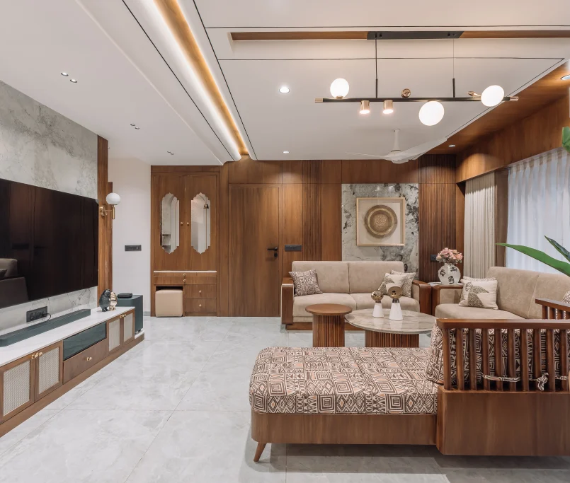
Brown
comfort.
Impact of Colors on Mood and Atmosphere
Now, let’s explore how different colors can be strategically used in interior design to evoke specific moods and create desired atmospheres:
Tranquil Retreat with Blues and Greens
Blue : Known for its calming properties, blue is an excellent choice for bedrooms, bathrooms, and spaces where relaxation is paramount. Light blues promote serenity, while deeper blues can add a touch of sophistication.
Green : Associated with nature and renewal, green is ideal for spaces where rejuvenation and balance are desired. It works well in bedrooms, offices, and areas designed for meditation or exercise.
Energizing and Invigorating with Reds and Yellows
Red : This passionate and energetic color can stimulate conversation and appetite, making it a great choice for dining rooms and kitchens. However, it should be used sparingly, as too much red can be overwhelming.
Yellow : The color of sunshine, yellow radiates warmth and optimism. It can brighten up kitchens, living rooms, and home offices, fostering a sense of positivity and creativity.
Soothing Neutrals and Grays
Gray : Versatile and sophisticated, gray works well in various spaces. Lighter grays can create a sense of calm, while darker grays add drama and contrast. Gray is often used as a neutral backdrop to let other colors shine.
Beige & Taupe : These warm neutrals evoke feelings of comfort and security, making them suitable for living rooms and bedrooms. They create a cozy, timeless ambiance.

Luxury and Elegance with Purples
Purple : Historically associated with royalty and luxury, shades of purple can add a touch of opulence to interiors. Lavender can create a serene atmosphere, while deep purples add drama and sophistication

Balancing with Earth Tones
Playful and Vibrant with Oranges
Creating Harmonious Color Schemes
Analogous Colors
Using neighboring colors on the color wheel creates a harmonious and cohesive atmosphere. For example, blending shades of blue and green in a room can evoke a sense of tranquility and nature.
Complementary Colors
Monochromatic Colors

Consider Cultural and Personal Influences
Conclusion
In the realm of interior design, color isn’t just about aesthetics; it’s a powerful tool for influencing mood and atmosphere. By strategically selecting and combining colors, interior designers have the ability to shape the emotions and well-being of those who inhabit a space. Whether you’re seeking relaxation in a serene blue bedroom or energy in a vibrant orange kitchen, understanding the psychology of color can help you transform your living spaces into harmonious and emotionally resonant environments. So, the next time you embark on an interior design project, consider the psychological impact of color to create a truly inviting and engaging space.